Summary
This tutorial reproduces the XGBoost + SHAP + GeoShapley integrated analysis method (as used in a Journal of Cleaner Production article) using Python. We first train an XGBoost model on a tabular dataset, then probe the model’s decision mechanism using three lenses: the model’s native feature_importances_, global and local explanations via SHAP values, and spatially aware attributions via GeoShapley, with a particular focus on (i) how geographic variables contribute to predictions and (ii) how geography interacts with other features.
Workflow
Results
Reference paper: Yan Chen, Sheng Jiao, Xinyue Gu, Shan Li. Decoding the spatiotemporal effects of industrial clusters on carbon emissions in a Chinese river basin. Journal of Cleaner Production, 2025, 516, 145851.
Below is the end-to-end code (broken into sections) followed by detailed explanations of what each part does and why.
What you need installed
pandas, numpy, matplotlib, scikit-learn, xgboost, shap, geoshapleypip install pandas numpy matplotlib scikit-learn xgboost shap geoshapley# ===== 1. Imports and global style =====
import pandas as pd
import numpy as np
import matplotlib
import matplotlib.pyplot as plt
import xgboost as xgb
from sklearn.model_selection import train_test_split
import shap
from geoshapley import GeoShapleyExplainer
# (Optional) If you run this in a desktop Python session and need a GUI backend:
# matplotlib.use('TkAgg')
# ---- Global style ----
plt.rcParams['font.family'] = 'sans-serif'
plt.rcParams['font.sans-serif'] = ['Times New Roman', 'SimHei'] # Fallback for Chinese labels
plt.rcParams['axes.unicode_minus'] = False # Show minus signs correctly
Why this matters
pandas, numpy), plotting (matplotlib), modeling (xgboost), train/test split (sklearn), and explainability (shap, geoshapley).# ===== 2. Load your data from Excel =====
print("--- Step 1: Loading data from Excel ---")
# >>> Replace this path with YOUR actual file path <<<
excel_path = r'model_simulation_results.xlsx'
# The Excel is assumed to contain a 'target' column (the prediction target)
# and feature columns, including two geographic coordinate columns 'LAT' and 'LON'
# (rename later if yours differ).
df_full_dataset = pd.read_excel(excel_path)
# Split features and target
df_features = df_full_dataset.drop(columns=['target'])
y = df_full_dataset['target']
# Keep feature names for plots
feature_names = df_features.columns.tolist()
print(f"Data loaded successfully with {len(feature_names)} features.")
target.LAT and LON. If your data uses different names (e.g., lat_dd, lon_dd), you’ll edit those names in the GeoShapley section.3) XGBoost model training
# ===== 3. Train an XGBoost regressor =====
print("\n--- Step 2: Training XGBoost model ---")

X_train, X_test, y_train, y_test = train_test_split(
    df_features, y, test_size=0.2, random_state=42
)

model = xgb.XGBRegressor(
    n_estimators=100,
    max_depth=5,
    learning_rate=0.1,
    objective='reg:squarederror',
    random_state=42
)
model.fit(X_train, y_train)
print("Model training complete.")
n_estimators=100: number of trees to grow. More trees capture more patterns but can overfit; tune in practice.max_depth=5: moderate tree depth to balance bias/variance.learning_rate=0.1: typical starting point; lower values often need more trees.objective='reg:squarederror': squared error loss for regression. For classification, you’d choose a different objective.4) Feature importance + visualization
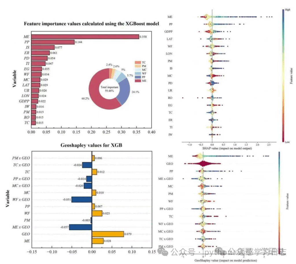
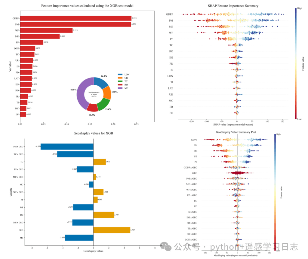
# ===== 4. Feature importance (model-native) & donut inset =====
print("\n--- Step 3: Extracting feature importances and plotting ---")

importances = model.feature_importances_

df_importance = pd.DataFrame({
    'feature': feature_names,
    'importance': importances
}).sort_values('importance', ascending=True)

fig, ax = plt.subplots(figsize=(12, 10))
bars = ax.barh(df_importance['feature'], df_importance['importance'],
               color='#d62828', label='Importance')

ax.set_title('Feature importance values calculated using the XGBoost model', fontsize=18, pad=20)
ax.set_ylabel('Variable', fontsize=16)
ax.tick_params(axis='both', which='major', labelsize=12)

for bar in bars:
    width = bar.get_width()
    ax.text(width, bar.get_y() + bar.get_height()/2,
            f' {width:.3f}', va='center', ha='left', fontsize=10)

ax.set_xlim(right=ax.get_xlim()[1] * 1.15)

# ---- Optional donut for a chosen subset of features ----
donut_features = ['LON', 'UR', 'TC', 'RO', 'ME']  # edit to match names present in your data
df_donut = df_importance[df_importance['feature'].isin(donut_features)].copy()
if not df_donut.empty and df_donut['importance'].sum() > 0:
    df_donut['feature'] = pd.Categorical(df_donut['feature'],
                                         categories=donut_features, ordered=True)
    df_donut = df_donut.sort_values('feature')
    total_donut_importance = df_donut['importance'].sum()
    donut_percentages_raw = df_donut['importance'] / total_donut_importance * 100

    ax_inset = fig.add_axes([0.4, 0.15, 0.3, 0.3])
    colors = matplotlib.colormaps.get('tab10').colors
    wedges, texts = ax_inset.pie(
        donut_percentages_raw,
        colors=colors[:len(df_donut)], startangle=90, counterclock=False,
        wedgeprops=dict(width=0.45, edgecolor='w')
    )

    subset_importance_ratio = df_donut['importance'].sum() / df_importance['importance'].sum()
    ax_inset.text(0, 0, f'Total importance\nof subset\n{subset_importance_ratio:.2%}',
                  ha='center', va='center', fontsize=8, linespacing=1.5)

    label_threshold = 2.0
    y_text_offsets = {'left': 1.4, 'right': 1.4}
    for i, p in enumerate(wedges):
        percent = donut_percentages_raw.iloc[i]
        ang = (p.theta2 - p.theta1)/2 + p.theta1
        y = np.sin(np.deg2rad(ang))
        x = np.cos(np.deg2rad(ang))
        if percent < label_threshold and percent > 0:
            side = 'right' if x > 0 else 'left'
            y_pos = y_text_offsets[side]
            y_text_offsets[side] += -0.2 if y > 0 else 0.2
            connectionstyle = f"angle,angleA=0,angleB={ang}"
            ax_inset.annotate(f'{percent:.1f}%', xy=(x, y),
                              xytext=(0.1*np.sign(x), y_pos),
                              fontsize=10, ha='center',
                              arrowprops=dict(arrowstyle="-", connectionstyle=connectionstyle))
        elif percent > 0:
            ax_inset.text(x*1.2, y*1.2, f'{percent:.1f}%',
                          ha='center', va='center', fontsize=11, fontweight='bold')

    ax_inset.legend(wedges, df_donut['feature'], loc="center left",
                    bbox_to_anchor=(1, 0.8), frameon=False, fontsize=12)

plt.savefig('feature.jpg', dpi=300, bbox_inches='tight')
plt.show()
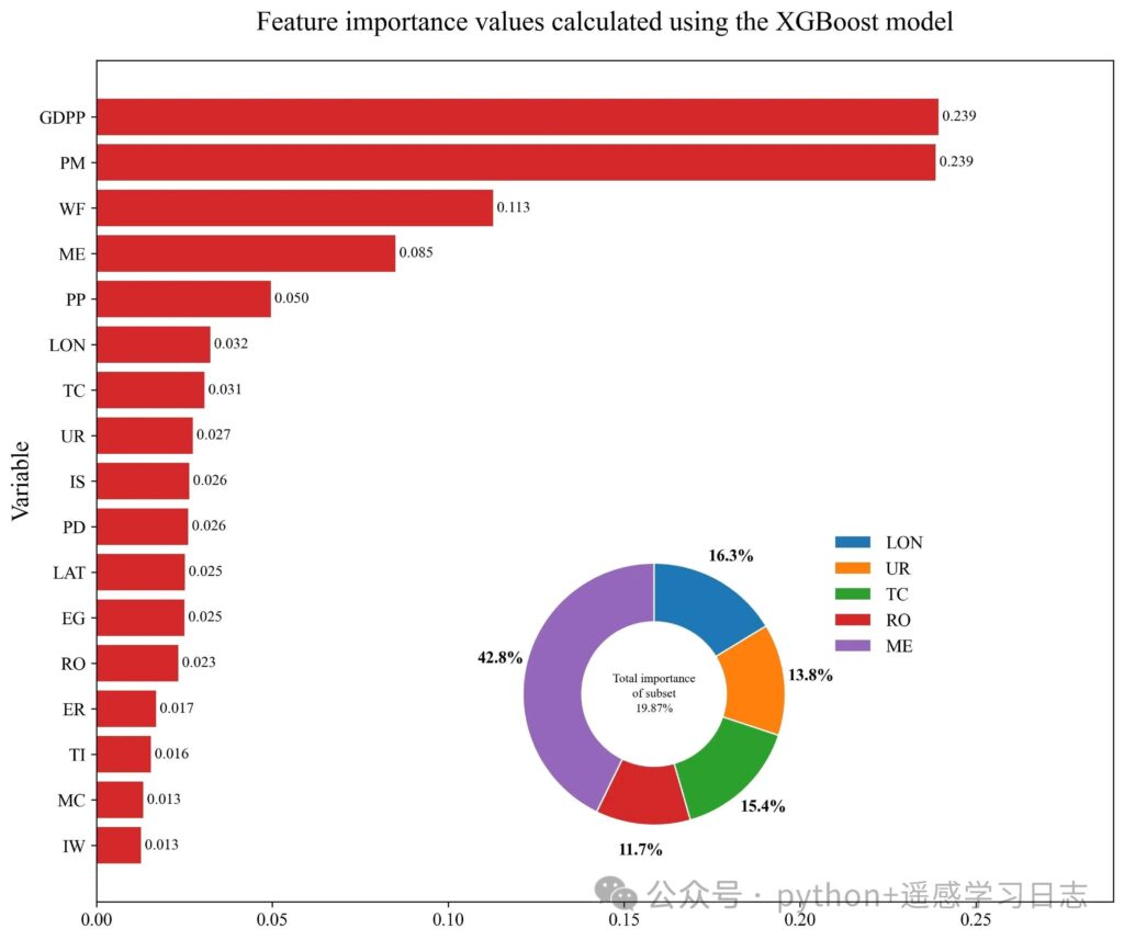
Interpretation
The donut inset shows the relative share of a hand-picked subset of features within that subset (not the whole model), which is useful when you want to highlight geography-related variables or a thematic group.
The horizontal bars rank features by model-native importance (gain/weight/cover depending on booster; for xgboost’s scikit wrapper, this defaults to the booster’s importance type).
# ===== 5. SHAP analysis =====
print("\n--- Step 4: Running SHAP analysis and plotting ---")

# A fast TreeExplainer for tree ensembles; baseline is inferred from the model
explainer = shap.TreeExplainer(model)
# Compute SHAP values for the whole dataset (consider subsampling for large data)
shap_values = explainer(df_features)

plt.figure(figsize=(10, 8))
shap.summary_plot(
    shap_values, df_features,
    plot_type="dot", cmap="RdYlBu",
    show=False, plot_size=None
)
ax2 = plt.gca()
ax2.set_title("SHAP Feature Importance Summary", fontsize=16)
ax2.set_xlabel("SHAP value (impact on model output)", fontsize=12)

plt.savefig('SHAP_summary_plot.jpg', dpi=300, bbox_inches='tight')
print("\n--- SHAP summary plot saved to: SHAP_summary_plot.jpg ---")
plt.show()
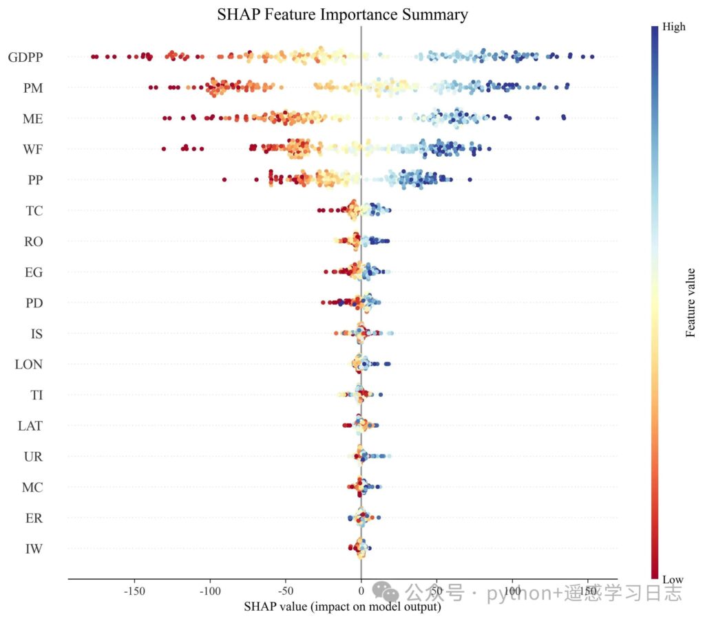
What this shows
Why SHAP complements feature_importances_
# ===== 6. GeoShapley analysis =====
print("\n--- Step 5: Running GeoShapley analysis ---")

# 6.1 Prepare background and run
background_data = df_features.sample(100, random_state=42).values
data_to_explain = df_features  # you can also pass X_test for speed

geoshap_explainer = GeoShapleyExplainer(model.predict, background_data)
print("GeoShapley computing... (single-core)")
geoshapley_results = geoshap_explainer.explain(data_to_explain, n_jobs=1)
print("GeoShapley analysis complete.")

# 6.2 Aggregate effects and build a diverging bar plot
print("\n--- Step 6: Aggregating results and plotting diverging bars ---")

# >>> If your coordinate column names differ, change them here <<<
coord_columns = ['LAT', 'LON']
non_spatial_features = [f for f in feature_names if f not in coord_columns]

# Mean effects across samples
mean_primary = pd.Series(
    geoshapley_results.primary.mean(axis=0),
    index=non_spatial_features
)
mean_interaction = pd.Series(
    geoshapley_results.geo_intera.mean(axis=0),
    index=[f'{f} x GEO' for f in non_spatial_features]
)
mean_spatial = pd.Series(
    geoshapley_results.geo.mean(),
    index=['GEO']
)

df_plot = pd.concat([mean_primary, mean_interaction, mean_spatial]).reset_index()
df_plot.columns = ['Variable', 'Value']

# Customize the order to match your narrative; example below:
vars_to_show = [
    'PM x GEO', 'TC x GEO', 'TC', 'PP x GEO', 'MC x GEO', 'MC',
    'WF x GEO', 'PP', 'WF', 'PM', 'ME x GEO', 'GEO', 'ME'
]
df_plot = df_plot[df_plot['Variable'].isin(vars_to_show)]
df_plot['Color'] = ['#e69f00' if x >= 0 else '#0072b2' for x in df_plot['Value']]
df_plot['Variable'] = pd.Categorical(df_plot['Variable'],
                                     categories=vars_to_show, ordered=True)
df_plot = df_plot.sort_values('Variable', ascending=False)

fig3, ax3 = plt.subplots(figsize=(10, 8))
ax3.barh(df_plot['Variable'], df_plot['Value'], color=df_plot['Color'])

for _, row in df_plot.iterrows():
    value = row['Value']
    ha = 'left' if value > 0 else 'right'
    offset = 0.002 if value > 0 else -0.002
    ax3.text(value + offset, row['Variable'], f'{value:.3f}',
             ha=ha, va='center', fontsize=9)

ax3.axvline(x=0, color='black', linewidth=0.8)
ax3.set_title('GeoShapley values for XGB', fontsize=16, pad=20)
ax3.set_xlabel('GeoShapley values', fontsize=12)
ax3.set_ylabel('Variable', fontsize=12)
ax3.spines['top'].set_visible(False)
ax3.spines['right'].set_visible(False)

current_xlim = ax3.get_xlim()
max_abs_lim = max(abs(current_xlim[0]), abs(current_xlim[1]))
ax3.set_xlim(-max_abs_lim * 1.2, max_abs_lim * 1.2)

plt.tight_layout()
plt.savefig('geoshapley_final_plot.jpg', dpi=300)
plt.show()

print("\n--- All analyses and plots completed successfully ---")

# ===== 6b. Built-in beeswarm summary plot =====
print("\n--- Step 7: Built-in GeoShapley beeswarm summary ---")
plt.figure(figsize=(10, 8))
geoshapley_results.summary_plot(include_interaction=True, cmap='RdYlBu')

ax2 = plt.gca()
ax2.set_title("GeoShapley Value Summary Plot", fontsize=16)
ax2.set_xlabel("GeoShapley value (impact on model prediction)", fontsize=12)

plt.savefig('geoshapley_beeswarm_plot_colored.jpg', dpi=300, bbox_inches='tight')
plt.show()
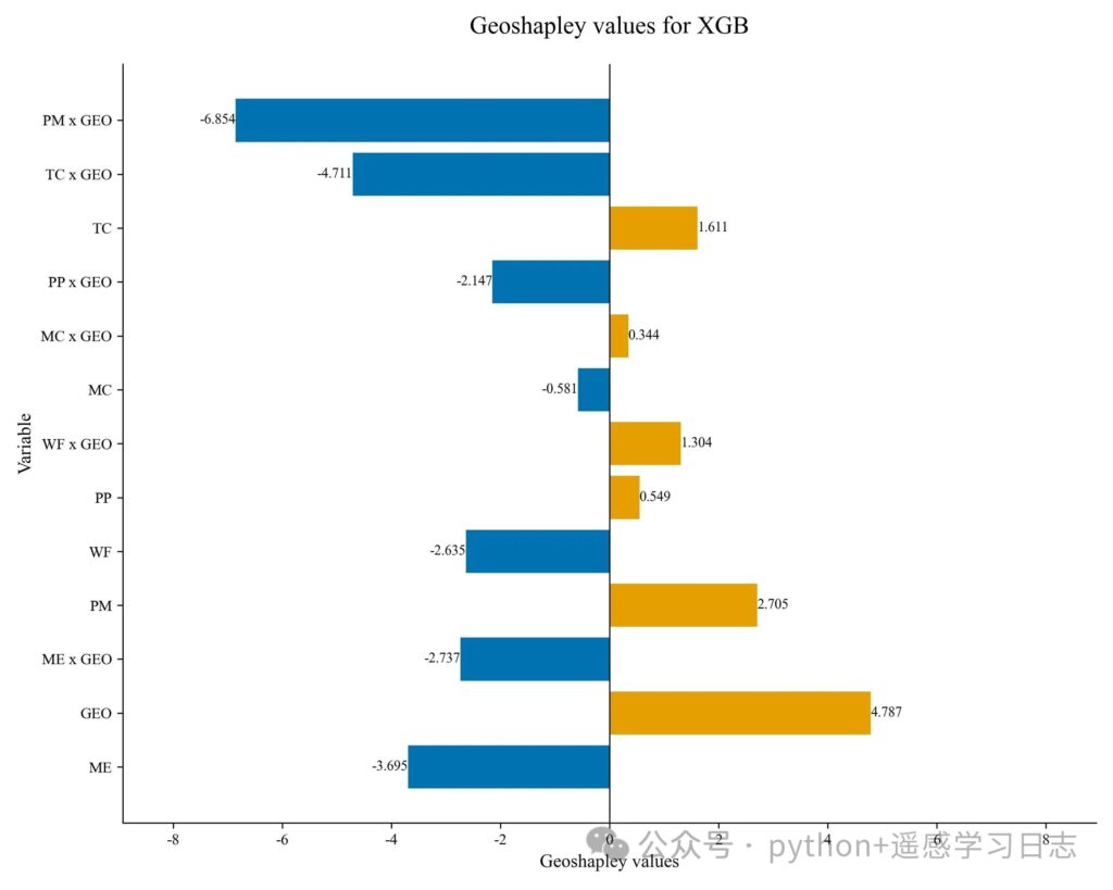
How to read the diverging bars
TC, MC) show how much each feature contributes independently of location.TC x GEO) quantify how much location modulates the effect of that feature. Positive bars: on average, the feature’s effect is amplified by geography; negative bars: dampened or reversed.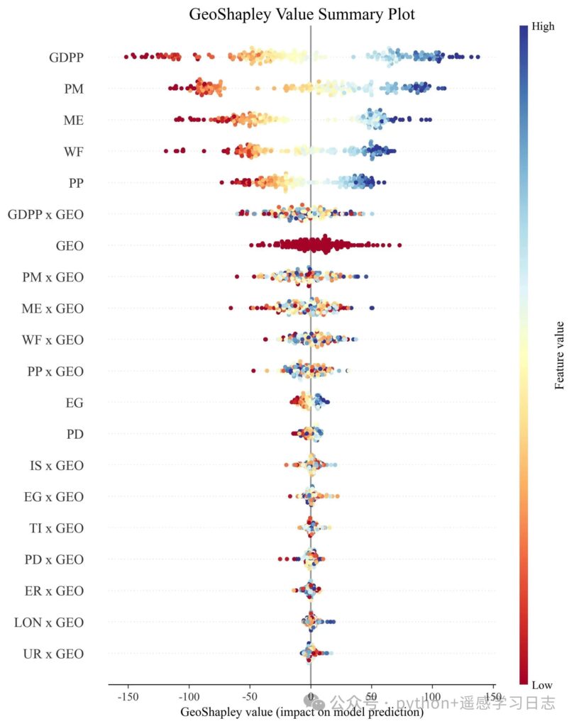
GeoShapley beeswarm
GEO effect), sorted by mean absolute GeoShapley.GEO (as defined by the algorithm).Paths
Runtime
n_jobs in geoshap_explainer.explain(..., n_jobs=<cores>) if your machine has more cores.X_test) to iterate faster.Coordinate columns
'LAT' and 'LON'. Change coord_columns = ['LAT', 'LON'] if needed.Why three lenses (complementarity)