This tutorial explores a visualization reproduction based on the paper Engineering Applications of Artificial Intelligence, combining residual analysis with model predictions. The data used here is simulated and carries no real-world significance. The author has implemented the code and generated charts based on their personal understanding of machine learning. While the details may not perfectly align with the original paper, this serves as a reference only. Detailed data and code will be uploaded to a discussion group later, and paid group members can download them from there. Friends who need this can check the purchase details provided at the end of the public post. Please reach out for consultation before purchasing to avoid unnecessary issues.
Paper Information

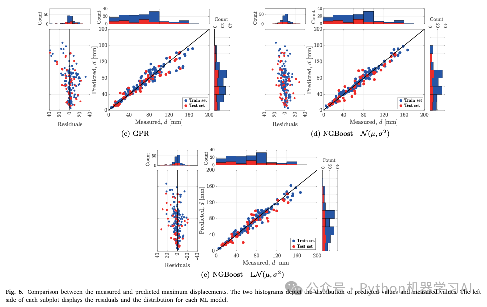
Original Figures
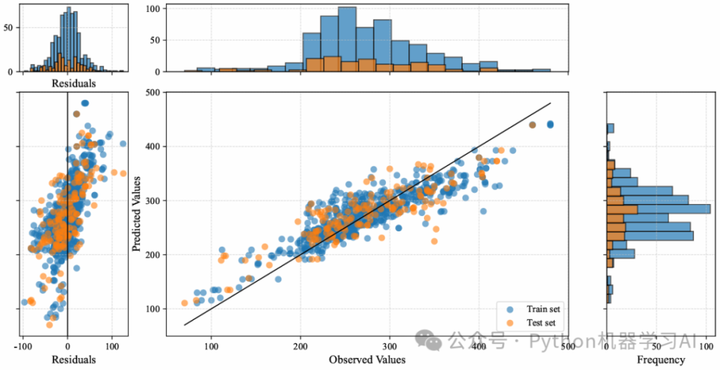
Reproduced Figures
Paper Insights
The charts in the literature showcase a comparison between different machine learning models’ predictions and measured data, particularly focusing on regression models tied to maximum displacement predictions. The visuals are broken down into these key components:
- Left Side: Residual Plot
This displays the residual distribution for each model, which is the difference between predicted and actual observed values. Residual plots help assess how well a model fits the data—ideally, residuals should be randomly scattered, indicating no systematic bias. - Right Side: Scatter Plots
These plots illustrate the relationship between predicted and actual measured values. Each point represents a data sample, with blue dots for the training set and red dots for the test set. In an ideal scenario, points should cluster along the diagonal line, showing that predictions closely match actual values. - Top and Right Histograms
These histograms show the distribution of predicted values (right) and observed values (top), offering further insight into how the data is spread.
In summary, this is a comprehensive chart for evaluating regression model performance, using scatter plots, residual plots, and histograms to analyze prediction capability and accuracy.
Understanding Residuals
Residuals are a critical concept in regression analysis, measuring the error in a model’s predictions. Simply put, a residual is the difference between the actual observed value and the predicted value:
Residual = Actual Value – Predicted Value
Residuals help evaluate how well a model fits the data. By analyzing them, you can detect systematic biases, check if regression assumptions (like linearity or constant variance) hold, and spot outliers or anomalies. Residual analysis also highlights a model’s weaknesses, guiding improvements. It’s a vital tool for assessing and refining regression model performance.
Basic Visualization Code
Here’s a snippet of the foundational code used for the visualization:
# Set a new color scheme
train_color = '#1f77b4'  # Training set: Blue
test_color = '#ff7f0e'   # Test set: Orange

# Set figure size and resolution
fig = plt.figure(figsize=(10, 8), dpi=1200)

# Plot training set
ax_main.scatter(y_train, y_pred_train, color=train_color, label="Train set", alpha=0.6)

# Plot test set
ax_main.scatter(y_test, y_pred_test, color=test_color, label="Test set", alpha=0.6)

# Add a reference line (black solid line, not in legend)
ax_main.plot([min(y_train.min(), y_test.min()), max(y_train.max(), y_test.max())],
             [min(y_train.min(), y_test.min()), max(y_train.max(), y_test.max())],
             color='black', linestyle='-', linewidth=1)

# Add grid lines to the main plot
ax_main.grid(True, which='both', axis='both', linestyle='--', linewidth=0.6, alpha=0.7)

# Customize main plot
ax_main.set_xlabel("Observed Values", fontsize=12)
ax_main.set_ylabel("Predicted Values", fontsize=12)
ax_main.legend(loc="lower right", fontsize=10)

# Top histogram (distribution of observed values)
ax_hist_x.hist(y_train, bins=20, color=train_color, alpha=0.7, edgecolor='black', label="Training Observed Distribution")
ax_hist_x.hist(y_test, bins=20, color=test_color, alpha=0.7, edgecolor='black')
ax_hist_x.tick_params(labelbottom=False)  # Hide x-axis labels
ax_hist_x.grid(True, which='both', axis='both', linestyle='--', linewidth=0.6, alpha=0.7)

# Right histogram (distribution of predicted values)
ax_hist_y.hist(y_pred_train, bins=20, orientation='horizontal', color=train_color, alpha=0.7, edgecolor='black')
ax_hist_y.hist(y_pred_test, bins=20, orientation='horizontal', color=test_color, alpha=0.7, edgecolor='black')
ax_hist_y.set_xlabel("Frequency", fontsize=12)
ax_hist_y.tick_params(labelleft=False)  # Hide y-axis labels
ax_hist_y.grid(True, which='both', axis='both', linestyle='--', linewidth=0.6, alpha=0.7)

# Save and display
plt.savefig("1.pdf", format='pdf', bbox_inches='tight')
plt.show()